Friday, 2 December 2011

Research into Filming Locations


Daisy Nook Country Park

Daisy Nook country park is located in Failsworth which is in Manchester. It contains a small lake that runs through the park and contains several other little lakes. It is popular for people who enjoy walks when it’s nice weather. It is quiet most of the time and has nice scenery such as tree’s and wide open spaces and I good view of the sky as its kept well tidy. We chose to film the opening scene here where Tom burns the picture of his ex-girlfriend and walks away because the location is secluded and is perfect for the opening scene. The bench on the picture above is the same bench that Tom sat on and burnt the picture at the beginning of the music video, so you can see for yourself how the location looks good and is also secluded. We shot about 3 clips in Daisy Nook which are clips of Tom burning the picture and then exiting the country park. We decided to have Tom start here as it brings emotion to the music video as he’s came to a quiet location to think about things and then burns the picture of his recent girlfriend.


Failsworth Road

Failsworth Road is a quiet road located close to Daisy Nook. On the left side of the road is a footpath but on the right side of the road there is a large field where several horses are usually located as its part of a farm. The picture to left is a shot of Failsworth road, we was originally going to film Douglas performing walking down this road but we decided to change as we found a path that was more secluded to film those shots. Instead we decided to film Tom walking down the road on the right hand side and luckily there was some horses there so we filmed Tom stroking the horses as Tom has a good vibe throughout the video helping people and having a good mood
as he’s over his ex-girlfriend. We thought it would be good to film here and think it’s appropriate as it’s hardly ever busy and is very close to Daisy Nook Country Park so it also links with where Toms walking as it’s not a completely different location.

The picture on the right is also on Failsworth road but it is at the beginning of the road just as it starts. We shot the scene where Tom meets a new girl he likes and walks off with her in the distance holding hands. We thought this spot would be good to film this scene as it’s a good meeting point. The way how there’s a single bench next to some steps covered in leaves on a small area of grass, it looks like the perfect place to meet somebody and it’s what we planned since we started the planning of our music video.


Secluded Path

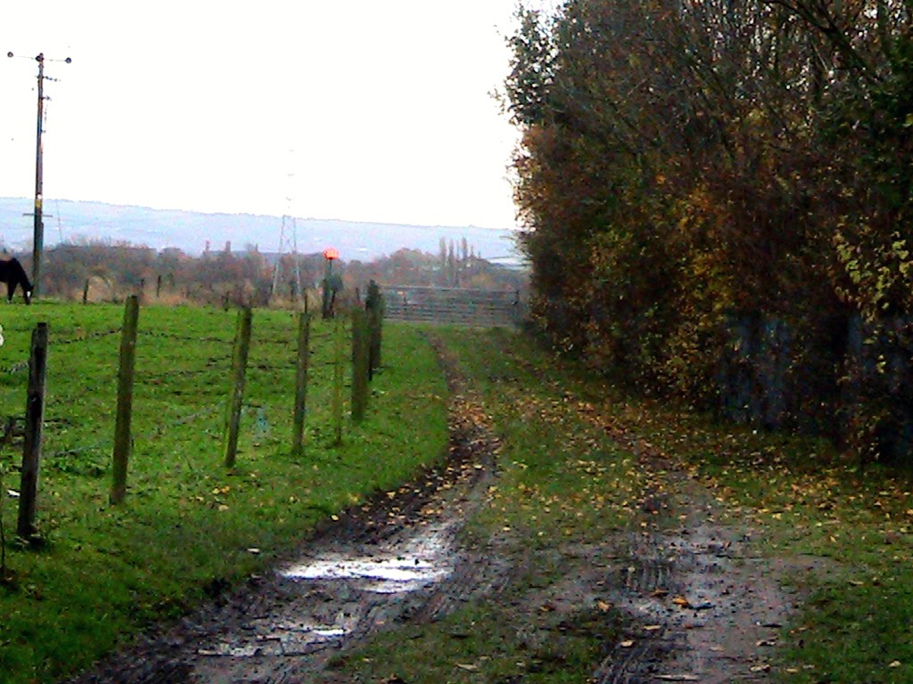
This is the path where we chose to film Douglas Jonathon Anthony Sweeney lip syncing the lyrics of the song Heartburn by Architects. This path is located in Failsworth quite close to daisy nook. We chose this spot to film as we wanted to film on a secluded path and we stumbled across this path when we was on the way to film on the original place Failsworth Road. It’s appropriate for Doug’s scenes as the path is even more secluded than we originally planned and at the end of the path as you can see in the picture there is a nice view of the countryside which we also took advantage of and got some shots of Douglas sat on the metal fence. We also got some landscape shots over the fence of the countryside and we also got some shots to the left of the path as there is a little lake there as it’s also part of a farm.


Public Street and Meeting Point

both of these locations are next to each other so we filmed from one location to another with the story. The picture on the left is where we filmed the clip with Sam (The Homeless Man) where Tom gives him money and continues his journey to meet the girl he likes. We chose to film here as it’s in the area Failsworth where we have been filming the rest of the music video and it’s a public street right next to a restaurant. We originally planned to film the scene further down, actually in front of the restaurant but a crime had occurred so we got asked to move. The road links to where the characters are travelling as it’s around the corner from daisy nook and the secluded path. The picture on the right is the meeting point where Tom and Doug both collide with each other. We thought this would be a good idea to do as the performer and the actor both walk past each other so the audience know they’re in the same location. We chose to film on a motorway bridge as it’s secluded and has nice viewpoints of the landscape of where we are filming. It also shows clearly that Tom and Doug are both walking in different directions.


POSTED BY TOM

Monday, 28 November 2011

Current Magazine design idea's.

Idea’s for magazine advert.

The ideas we have for our Magazine advert design are either; a picture of Doug as he is the lead singer, a picture of a burning photograph that features in the video or an image of Tom and Doug as these are the main features of the video. We are still in the planning process and still research ideas of what image to have and how to lay it out.The advert will be A4 size, to make other adverts and will be in colours such as blue, grey, green, black or something along these lines as it will be quite dull as it matches the theme and the style the original band use, yet we will make it eye catching and interesting. It will be advertising the song ‘Heartburn’ therefore it will contain details about the record, its release date, producers, and a ‘barcode’ along the bottom as it makes it more authentic and like an original magazine advert. We are going to create the design using Photoshop, as this is one of the best programs for editing and creating images and items. Photoshop allows you to do almost anything to an image and edit it to a very high standard. It will help us to make our advert look very realistic and exciting.


Similar Genre Magazine adverts:


Posted by, Bethany.

Finished Video, the process so far.

We have finished the editing for our music video now and it is all complete. During the editing process we had to go into the studio and do some re-filming as we decided to include a ‘Master Shot’ into a video, so we had a scene to keep going back to. This idea was given to us after our teacher had watched the video so far and decided it needed something else adding to it. We played the song and just filmed Doug singing the whole song from different angles and in different positions. We tried different things like filming his shadow for a new effect and to make it a bit more interesting, and we think it works in the video. We put the master shot into our video and kept referring back to it after different scenes. It looks more like a music video that has been performed in a studio. Doug was the main person to do the editing, so he put in the different effects and styles to the video which work really well and helps the video to look better but not to over edited or anything. On the last day of editing we all watched the video numerous times to check the lip syncing was right and in time, and to see what our thoughts were with the final edit. We were happy with it, and felt it worked well with all the scenes; the lip syncing isn’t great but with the master shot it looks good.
We are currently discussing ideas of what images to have as the CD cover and Magazine advert, and how to do the layout for them. Beth and Tom are going to be doing the CD cover and advert using Photoshop. We are splitting the Music video evaluation questions between the three of us, and the rest of the blog work. We are going to create a questionnaire and ask a selection of people to view our video and note down their thoughts and answer the questionnaire. We will upload a copy of the questions to the blog, along with a section on people’s answers and view’s about our video.


Posted by, Bethany.

Costume research


Douglas’ costume

The Costume is researched thoroughly as the forecast for the weather will be cold with a chance of snow. The long sleeve to will be used as the top is a merchandised top for the band Architects, to go with the genre. Skinny jeans are typical of the genre aswel, as the band usually all wea them in videos or even live shows.


Thomas’ costume

Tom’s costume will be similar to Douglas’. He will be wearing skinny jeans to follow the stereotypical look of a person who plays or listens to the alternative rock genre. There will be rain on our filming days so Thomas will also be wearing a wooly hat and a thick water proof coat for the conditions that there will be rain.


Homeless mans costume

The homeless person will be dressed for the weather aswel. He will be wearing a coat which looks ragged and worn out with cup to put his change in from Tom this emphasizes that he is homeless and has to cope in these conditions. The homeless male will also be wearing a hat. His pants will be joggers will also look worn out.


Lover girl costume

The costume will be appropriate to the weather and to fit a female style of the genre. She will have a warm padded red coat and denim shorts with leggins considering the weather that day. She will also be female winter gloves which allows follows the weather on the day.


POSTED BY DOUG

Images of the Editing process.


Posted by, Bethany.


Thursday, 24 November 2011

Our inspirations for our music video


Our main inspirations for the narrative and performance within our music video came from listening to the lyrics and trying to base our video around the lyrics and what they say.
We watched the official video for the song and had a discussion to discuss our ideas and thoughts about what the narrative could be. We decided that as the song is quite dull and has a kind of depressing mood to it, we couldn’t do anything really upbeat and really happy and crazy, as it wouldn’t match the theme of the song therefore this affected the type of narrative we decided to do. Throughout the song we decided to have Tom walking and helping people such as a homeless man by giving him change and stroking a horse. This is because we wanted the narrative to be helping people and making people smile and things, as this is mentioned throughout the lyrics of the song.


We didn’t get any inspirations from any TV programs or anything like that; it was all from listening to the lyrics and trying to come up with our own ideas.
We decided that the end of the song had kind of a ‘happy ending’ to it. This is why we had Tom meeting a girl at the end of the video as it shows the audience it is a happy ending and lightens the mood.
We decided to film the whole song in the green screen also so then we have a Master shot to refer back to throughout of video, and so it looks like Doug is actually performing in a studio. We filmed Doug as the performance aspect of the music video and had his singing the song in different locations either stood still or walking and singing. We filmed Tom as the narrative and storyline of the music video walking through different locations and doing different things along the way until he meets the girl at the end.

We didn’t have any particular costume ideas for our video. It’s just a simple video that doesn’t need any specific major costumes or props to go with it.
As the music genre for our video is ‘Alternative rock or indie’ we just carried the same dress sense as most other artist’s in this similar genre. The dress code we used was skinny jeans, jumpers and everyday shoes. It was cold on the days when we were filming so Tom was wearing his hat but it fits in with the dress code. The only major prop in our music video was the burning photograph at the start of it which was an image of Tom and another girl which we have the camera focused on for the beginning of our video. Another specific prop we used was a clock, where we moved the hands round really fast to match the lyrics of 'time standing still forever' it was kind of a juxtaposition. There was no other major props throughout our music video that we needed, everything else we just decided on the day of filming or picked up as we were.

We came up with ideas on what locations to use came from researching local areas which are quiet and empty as this is what the locations used in the original music video were like. We decided on using an area in Failsworth called ‘Woodhouse’s’ as it is a nice, quiet area and were perfect for our filming.
There weren’t many people in this area so our filming didn’t get interrupted and we were able to film a lot in a few hours. We were originally going to go to an area called ‘Daisy nook’ however we didn’t need to as when we were walking around Woodlouses we found plenty of areas to film our video so we didn’t need to go there.


Posted by, Bethany.

Wednesday, 23 November 2011

Cd Cover Analysis of All Killer No Filler by Sum 41


Front

The front cover of this album looks very low budget and easy to make. It includes all 4 members of the band Sum 41 Deryck, Jason, Steve and David on the front cover pulling funny faces. They’ve just opened their mouths and shook their heads from left to right very fast resulting in air catching in their mouths making them puff out the way they do in the pictures . This band also has sense of humour and is looked up to by a lot of teenagers who come from the punk scene. The pictures aren’t exactly high quality but they do look funny and the band has done this to show their sense of humour. The look of the album cover has a tiled effect like how the pictures are in 16 squares that fill up the whole front and then in the American colour scheme Red, White and Blue is the band Logo and album name. The band logo stands out from everything else on the page due to its bright colours and this is supposed to stand out so people who like the band know it’s their album. The name of the album also stands out but not as much as it’s in a red font on a strip in-between a line of photo’s but is easy readable. The album came out in 2001 so that can explain as to why the picture quality isn’t that good but I think the band actually wanted this look as it gives it a vintage polaroid effect.

Inside Front

Inside of the front cover looks almost identical to the front cover but without the band name and logo. It has the same tile Polaroid effect as the front cover but it’s different and has a meaning. They’ve done the exact same thing as the front cover only this time the people that are shown doing the puffed out face are the producers of the album and some friends of the band. The band has done this because it’s a way to say thank you and they’ve decided to include photos of them inside the case to show you who the people are who helped them produce a very successful album. Also they’ve made them do the funny faces just for comedy as its funny seeing photos of the producers and friends of the band who are never usually seen by millions of people unlike the band. So the inside of the front cover is important as it shows you the key people who helped and support Sum 41 to make this album.

Inside Back

The inside of the back cover of the album is extremely important. At the top it has the bands logo the exact same one we see on the front of the album and once again it stands out the most on this page over everything else. This page is also a way of saying thanks but it also tells you a lot of information. Under the Sum 41 logo there is the nicknames of the band members in large white bold writing and the positions they play in the band in the same red font from the front cover next to them. These stand out over all over text on the page apart from the logo as their important. Other information on the page includes the producers of the album and basically everybody who had some input in helping with the album getting made. Towards the bottom of the page there is a huge list of names and just above the names there is a title saying ‘Thanks’ so they are all the names the band would like to thank so this could be close friends and people who have had an impact on them whilst making the album. Inside the cd case on both sides are thank you pages which was nice of the band to do, because they’re trying to get across that they don’t deserve all the credit just because they produce the music.

Back

The back of this CD case makes a change from the rest of the CD Case. The rest of the case contains dark colours such as the front cover except the band logo and on the inside of the case it uses the colour black a lot. In this shot of the band it’s quite colourful, the way how the band have got a photo lounging around in a room in front of some bright multi coloured floral wallpaper. I think the band have done this, so it purposely stands out from the rest of the case and so you can see clearly who the band members are without them pulling any funny faces. There are cans of beer in the middle of the photo and if you look at the band members them all seem to look rough so this photo could represent that they’ve been partying and are all hung-over. At the top of the back cover it has a black background with the names of the songs in a white font with red numbering. This is again sticking to the colour scheme of the rest of the Cd Cover. In large bold red letters underneath the track list it contains who it was produced by and has the bands website and the record company’s website. Both of these things are important as it tells you the name of the person who actually produced the album and the websites can be used to access further information about the band and album. Also in the bottom right corner which is difficult to see, but it also contains the bands record companies logo which is island records and it’s a small white palm tree on a black background.

Posted by Tom