Monday, 28 November 2011

Current Magazine design idea's.

Idea’s for magazine advert.

The ideas we have for our Magazine advert design are either; a picture of Doug as he is the lead singer, a picture of a burning photograph that features in the video or an image of Tom and Doug as these are the main features of the video. We are still in the planning process and still research ideas of what image to have and how to lay it out.The advert will be A4 size, to make other adverts and will be in colours such as blue, grey, green, black or something along these lines as it will be quite dull as it matches the theme and the style the original band use, yet we will make it eye catching and interesting. It will be advertising the song ‘Heartburn’ therefore it will contain details about the record, its release date, producers, and a ‘barcode’ along the bottom as it makes it more authentic and like an original magazine advert. We are going to create the design using Photoshop, as this is one of the best programs for editing and creating images and items. Photoshop allows you to do almost anything to an image and edit it to a very high standard. It will help us to make our advert look very realistic and exciting.


Similar Genre Magazine adverts:


Posted by, Bethany.

Finished Video, the process so far.

We have finished the editing for our music video now and it is all complete. During the editing process we had to go into the studio and do some re-filming as we decided to include a ‘Master Shot’ into a video, so we had a scene to keep going back to. This idea was given to us after our teacher had watched the video so far and decided it needed something else adding to it. We played the song and just filmed Doug singing the whole song from different angles and in different positions. We tried different things like filming his shadow for a new effect and to make it a bit more interesting, and we think it works in the video. We put the master shot into our video and kept referring back to it after different scenes. It looks more like a music video that has been performed in a studio. Doug was the main person to do the editing, so he put in the different effects and styles to the video which work really well and helps the video to look better but not to over edited or anything. On the last day of editing we all watched the video numerous times to check the lip syncing was right and in time, and to see what our thoughts were with the final edit. We were happy with it, and felt it worked well with all the scenes; the lip syncing isn’t great but with the master shot it looks good.
We are currently discussing ideas of what images to have as the CD cover and Magazine advert, and how to do the layout for them. Beth and Tom are going to be doing the CD cover and advert using Photoshop. We are splitting the Music video evaluation questions between the three of us, and the rest of the blog work. We are going to create a questionnaire and ask a selection of people to view our video and note down their thoughts and answer the questionnaire. We will upload a copy of the questions to the blog, along with a section on people’s answers and view’s about our video.


Posted by, Bethany.

Costume research


Douglas’ costume

The Costume is researched thoroughly as the forecast for the weather will be cold with a chance of snow. The long sleeve to will be used as the top is a merchandised top for the band Architects, to go with the genre. Skinny jeans are typical of the genre aswel, as the band usually all wea them in videos or even live shows.


Thomas’ costume

Tom’s costume will be similar to Douglas’. He will be wearing skinny jeans to follow the stereotypical look of a person who plays or listens to the alternative rock genre. There will be rain on our filming days so Thomas will also be wearing a wooly hat and a thick water proof coat for the conditions that there will be rain.


Homeless mans costume

The homeless person will be dressed for the weather aswel. He will be wearing a coat which looks ragged and worn out with cup to put his change in from Tom this emphasizes that he is homeless and has to cope in these conditions. The homeless male will also be wearing a hat. His pants will be joggers will also look worn out.


Lover girl costume

The costume will be appropriate to the weather and to fit a female style of the genre. She will have a warm padded red coat and denim shorts with leggins considering the weather that day. She will also be female winter gloves which allows follows the weather on the day.


POSTED BY DOUG

Images of the Editing process.


Posted by, Bethany.


Thursday, 24 November 2011

Our inspirations for our music video


Our main inspirations for the narrative and performance within our music video came from listening to the lyrics and trying to base our video around the lyrics and what they say.
We watched the official video for the song and had a discussion to discuss our ideas and thoughts about what the narrative could be. We decided that as the song is quite dull and has a kind of depressing mood to it, we couldn’t do anything really upbeat and really happy and crazy, as it wouldn’t match the theme of the song therefore this affected the type of narrative we decided to do. Throughout the song we decided to have Tom walking and helping people such as a homeless man by giving him change and stroking a horse. This is because we wanted the narrative to be helping people and making people smile and things, as this is mentioned throughout the lyrics of the song.


We didn’t get any inspirations from any TV programs or anything like that; it was all from listening to the lyrics and trying to come up with our own ideas.
We decided that the end of the song had kind of a ‘happy ending’ to it. This is why we had Tom meeting a girl at the end of the video as it shows the audience it is a happy ending and lightens the mood.
We decided to film the whole song in the green screen also so then we have a Master shot to refer back to throughout of video, and so it looks like Doug is actually performing in a studio. We filmed Doug as the performance aspect of the music video and had his singing the song in different locations either stood still or walking and singing. We filmed Tom as the narrative and storyline of the music video walking through different locations and doing different things along the way until he meets the girl at the end.

We didn’t have any particular costume ideas for our video. It’s just a simple video that doesn’t need any specific major costumes or props to go with it.
As the music genre for our video is ‘Alternative rock or indie’ we just carried the same dress sense as most other artist’s in this similar genre. The dress code we used was skinny jeans, jumpers and everyday shoes. It was cold on the days when we were filming so Tom was wearing his hat but it fits in with the dress code. The only major prop in our music video was the burning photograph at the start of it which was an image of Tom and another girl which we have the camera focused on for the beginning of our video. Another specific prop we used was a clock, where we moved the hands round really fast to match the lyrics of 'time standing still forever' it was kind of a juxtaposition. There was no other major props throughout our music video that we needed, everything else we just decided on the day of filming or picked up as we were.

We came up with ideas on what locations to use came from researching local areas which are quiet and empty as this is what the locations used in the original music video were like. We decided on using an area in Failsworth called ‘Woodhouse’s’ as it is a nice, quiet area and were perfect for our filming.
There weren’t many people in this area so our filming didn’t get interrupted and we were able to film a lot in a few hours. We were originally going to go to an area called ‘Daisy nook’ however we didn’t need to as when we were walking around Woodlouses we found plenty of areas to film our video so we didn’t need to go there.


Posted by, Bethany.

Wednesday, 23 November 2011

Cd Cover Analysis of All Killer No Filler by Sum 41


Front

The front cover of this album looks very low budget and easy to make. It includes all 4 members of the band Sum 41 Deryck, Jason, Steve and David on the front cover pulling funny faces. They’ve just opened their mouths and shook their heads from left to right very fast resulting in air catching in their mouths making them puff out the way they do in the pictures . This band also has sense of humour and is looked up to by a lot of teenagers who come from the punk scene. The pictures aren’t exactly high quality but they do look funny and the band has done this to show their sense of humour. The look of the album cover has a tiled effect like how the pictures are in 16 squares that fill up the whole front and then in the American colour scheme Red, White and Blue is the band Logo and album name. The band logo stands out from everything else on the page due to its bright colours and this is supposed to stand out so people who like the band know it’s their album. The name of the album also stands out but not as much as it’s in a red font on a strip in-between a line of photo’s but is easy readable. The album came out in 2001 so that can explain as to why the picture quality isn’t that good but I think the band actually wanted this look as it gives it a vintage polaroid effect.

Inside Front

Inside of the front cover looks almost identical to the front cover but without the band name and logo. It has the same tile Polaroid effect as the front cover but it’s different and has a meaning. They’ve done the exact same thing as the front cover only this time the people that are shown doing the puffed out face are the producers of the album and some friends of the band. The band has done this because it’s a way to say thank you and they’ve decided to include photos of them inside the case to show you who the people are who helped them produce a very successful album. Also they’ve made them do the funny faces just for comedy as its funny seeing photos of the producers and friends of the band who are never usually seen by millions of people unlike the band. So the inside of the front cover is important as it shows you the key people who helped and support Sum 41 to make this album.

Inside Back

The inside of the back cover of the album is extremely important. At the top it has the bands logo the exact same one we see on the front of the album and once again it stands out the most on this page over everything else. This page is also a way of saying thanks but it also tells you a lot of information. Under the Sum 41 logo there is the nicknames of the band members in large white bold writing and the positions they play in the band in the same red font from the front cover next to them. These stand out over all over text on the page apart from the logo as their important. Other information on the page includes the producers of the album and basically everybody who had some input in helping with the album getting made. Towards the bottom of the page there is a huge list of names and just above the names there is a title saying ‘Thanks’ so they are all the names the band would like to thank so this could be close friends and people who have had an impact on them whilst making the album. Inside the cd case on both sides are thank you pages which was nice of the band to do, because they’re trying to get across that they don’t deserve all the credit just because they produce the music.

Back

The back of this CD case makes a change from the rest of the CD Case. The rest of the case contains dark colours such as the front cover except the band logo and on the inside of the case it uses the colour black a lot. In this shot of the band it’s quite colourful, the way how the band have got a photo lounging around in a room in front of some bright multi coloured floral wallpaper. I think the band have done this, so it purposely stands out from the rest of the case and so you can see clearly who the band members are without them pulling any funny faces. There are cans of beer in the middle of the photo and if you look at the band members them all seem to look rough so this photo could represent that they’ve been partying and are all hung-over. At the top of the back cover it has a black background with the names of the songs in a white font with red numbering. This is again sticking to the colour scheme of the rest of the Cd Cover. In large bold red letters underneath the track list it contains who it was produced by and has the bands website and the record company’s website. Both of these things are important as it tells you the name of the person who actually produced the album and the websites can be used to access further information about the band and album. Also in the bottom right corner which is difficult to see, but it also contains the bands record companies logo which is island records and it’s a small white palm tree on a black background.

Posted by Tom

Cd Cover Analysis of Enema of the State by blink-182


Front

On the nurses work shirt you can see the band name blink-182 written in a colourful font on a colourful background that stands out from the white shirt the nurse is wearing. This is important as it’s the bands name so people who want to buy the album know its blink-182’s album. The main thing about the album cover is the way the bands used a nurse as a sexual icon by having her reveal some cleavage right next to the band name so it will attract people’s attention to the album cover to make them look. The album is called Enema of the state but it does not include the name of the album on the front cover as you can see, but elsewhere on the album it does like on the back and sides of the case. The model on the front of the CD cover is linked to the band as she features in a music video for one of blink-182’s songs ‘What’s My Age Again?’ Which is a track on the actual album. The song ‘What’s My Age Again’ was released as a single before the album ‘Enema of A State’ was released and so was the music video for ‘What’s My Age Again’. So people who like the band blink-182 can probably recognize the model from the music video, and ‘What’s My Age Again’ is the most known song from blink-182 so it’s quite clever what they've done.


Inside the Front and Back

Inside the CD case it has taken up both the front and back of the CD case as you can see, instead of having a separate picture on both sides of the cover. The picture is a shot of 8 men all wearing swimwear/underwear standing in front of some cyan lockers. The 4th, 6th and 8th men in the queue are the 3 members of blink-182 (Mark, Tom and Travis). The picture links with both the Front and the Back of the CD cover. It does this because on the front we can see the nurse up close with nothing else there, whereas on the back you can see Mark, Tom and Travis sat on a table with the nurse sat in front of them and they’re wearing swimwear like in this photo. So this tells us that this photo could be a queue to see the sexual icon that is the model nurse. The band does have a large sense of humour so that can explain why Mark the first member is wearing very tight swimwear compared to the rest of the men queuing up. The colour scheme the band has used on this photo is quite colourful but mainly focusing on the colour blue. On the front cover they also focus on the colour blue as the nurse has a blue tattoo and is wearing a blue glove but also more importantly the outline around the bands logo is light blue.


Back

The back of the CD case is the most important part of the whole CD Case. It contains the nurse from the front of the cover who is helped to promote the band as she starred in ‘What’s My Age Again’ and is a model. The cover also contains the 3 members of blink-182 Mark, Tom and Travis which is important as they’re the members of the band who produces the music for the album. I think the band personally chose to do a back cover like this to show that they have a sense of humour as the nurse is sitting in front of them all holding a giant syringe and Mark the one to the far left in the white swim shorts looks happy and the other two members Tom and Travis look scared. The band once again have also gone for the colour scheme of blue in this shot as the floor of the room they’re in, is light blue colour and at the top of the back cover the background of the band name and album name is light blue. I think the band have tried to go for the colour scheme of red, white and blue as those are the colours of the American flag and the album does contain the word ‘State’ and the band comes from California. At the top of the back cover it contains the band name and the band album which it doesn’t on the front of the cover on a blue background. It also contains the track listing on the album which is very important so buyers know what songs are on the album obviously. In the top left corner it also has the bands record company which is important s without that record company the band probably wouldn’t of been able to make the album.


Posted by Tom

Sunday, 20 November 2011

Filming Finished

Today I shot the final scene of our music video with my friend Alex in the location where it was planned to be shot. The scene was where I ( The actor in the music video) bump into the girl I like and give her a hug then walk off into the distance with her happily holding hands. This scene should of been shot earlier as its an important part of the music video but we had some slight issues trying to get the location where it was almost deserted and we really didn't want to change location as its perfect for the scene.

Thursday, 17 November 2011

About the band..

Architects are an English Metal core band from Brighton, England, formed in 2004. The band went through several name changes before they decided upon Architects. Their first name was Inharmonic, which was swiftly changed to Counting the Days. After a couple of years this was in turn changed to Architects.


Band members..


Sam Carter – lead vocals, keyboards (2007–present)


Tim Hillier-Brook – guitars (2004–present)


Dan Searle – drums, percussion (2004–present)


Tom Searle – guitars (2004–present)


Alex "Ali Dino" Dean – bass guitar (2006–2011, 2011–present)


Architects was founded in 2004 and are currently signed to Century Media Records worldwide and Distort Entertainment in Canada. The band has toured the UK and Europe with bands such as Bring Me The Horizon and The Chariot. They have played at a number of independent UK festivals, as well as the Download Festival 2007 and 2009, and Sonisphere 2009 and 2011. The band have completed a European tour and a Canadian tour, receiving great receptions from crowds in different countries and gradually spreading their fan base.


The band currently have 5 different albums released since 2006-2011. Their most recent one being ' The Here and Now' which features the song we are using for our music video, 'Heartburn'.


Posted by, Bethany

Research into music genre

The genre of our chosen music video is ' Alternative Rock'.


We have looked into and researched what 'Alternative Rock music' actually is, and some history behind it.


In the 1980s and 1990s, a new genre of rock music emerged and quickly gained the title college rock because of its prominence on college radio. During the '80s, alternative included everything from jangle pop, post-hardcore punk, funk metal, punk pop, and experimental rock. Eventually, the name of the genre became alternative music because of its new sound that did not draw from the more typical heavy metal and new wave genres popular at the time. The style instead built a post-punk era defined by indie sounds and rock roots. Alternative music was extremely popular through the 1980s and into the mid-1990s, when the genre experienced a decline in popularity. In the '80s, most alternative bands were on independent labels; if they were on majors, they didn't receive as much support as most of the label's mainstream acts.


Sounds range from the dirty guitars of grunge to the gloomy soundscapes of gothic rock to the guitar pop revivalism of Brit-pop to the shambolic performance style of tweepop. More often than in other rock styles since the mainstreaming of rock music during the 1970s, alternative rock lyrics tend to address topics of social concern, such as drug use, depression, and environmentalism. This approach to lyrics developed as a reflection of the social and economic strains in the United States and United Kingdom of the 1980s and early 1990s.


Alternative Rock is usually characterized by bands who have a "do-it-yourself" or non-conformist attitude; hence "alternative". It is not usually designed to be a popular genre of music or well known to all cultures. The label “Alternative” often applies to new music/bands before they become more widely popular due to creative people whose music does not fit into current genres.


Popular Alternative rock bands in the 1990's are ones such as Nirvana, Red Hot Chili Peppers, Foo Fighters, Pearl Jam, etc. It started out as an underground/indie scene, but when it became popular in the 90's, Alternative became separate from a new emerging indie style.


Posted by, Bethany


Wednesday, 16 November 2011

Advert analysis


The main feature to Green day’s album advert is the background image to the advert is the album cover for the new album ‘21st century breakdown’ and is a clear importance to selling and marketing the release of album by giving you a look of how the case will look and maybe what the songs will be about, for example and breakdown or relationships. This feature is similar in most album adverts to show the audience what it will look like. Another feature used in the advert is the headline shown on top of the advert. The writing used follows the genre of the music and targets the intended audience of punk rock. ‘The wait is finally over’ is key to the fans of green day, as they will get to see when the release date is and wont have to wait any longer to hear green days new album. A key feature in selling the advert to the audience is the white font at the bottom of the advert telling the audience the release date of the album. This advert in particular is good because it uses the same font which is stereotypical of punk rock fans and it also gives a release date not just for the CD but the release of the album vie download for example, iTunes. This is different to other album adverts as others just mainly show the release date for the CD and not the release of maybe download or a single from the album. This brings the album advert to another feature of showing a single that is maybe in the charts and has been released before the release of the album. This will attract fans of many audiences who may just like the song and want to buy the album to hear the rest of the songs. Overall the features for green day’s album advert are similar to many other adverts, but is key to attract the fans of punk rock and green day fans.


Monday, 14 November 2011

Change of Location

On Sunday I went to film a scene for the music video where i give a homeless man(my friend sam) some money. He was originally supposed to be sat in a phone box as a shelter for him but I was unable to film in this location as there was several police officers around as a crime had been committed in the area. I tried to film the scene but a policeman asked me to film somewhere else and that the street is going to be closed for a few days. So i resorted to simply having my friend Sam lie on the pavement near by as if he was asleep. So I decided to make this slight change to the music video and to be honest i think it looks better.

Thursday, 10 November 2011

Editing so far.

As mentioned on a previous post, we have uploaded all the video files from the SD card onto the computer and into final cut pro. We are currently half way through editing, and just piecing all the scenes/clips together. We haven’t done a lot of editing or used too much special effect to our clips we have kept them the way they looked when they were filmed. This is because our song is a romantic, slow paced song, so if we used a lot of editing in our video it would ruin it and wouldn’t be the style that we want it. So far we have put a minute or so together of our video. The lip-syncing isn’t great so we may have to either repeat filming or use the green screen to fix these areas. We are trying to include more visuals into our video to make it seem like more is going on, even if the clips are random and don’t make a lot of sense in the song, it still makes the video interesting. During the chorus of the song, the pace speeds up a little so we are currently trying to make the clips and editing match this pace.

Final cut pro is really good software for editing different filming productions as it allows you to do almost anything to the clips and change them the way you want. It has enabled us to put our song choice onto one of the sound timelines, which makes it easier for us to edit as we can check the lip syncing, the pace and weather it matches and looks okay.

We have done around half the editing for our video, so we will need a few more hours to complete and perfect it along with the extra filming we may need to do. After this we will make a start on producing the magazine and CD cover using Photoshop to design and complete this.

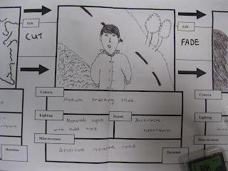
Storyboard Pictures


Posted By Tom.


Cd Cover Analysis of Brand New Eyes by Paramore


Front


In the top right corner of the cd cover you can see the band name ‘Paramore’ and the name of the album ‘Brand new eyes’. These are both important, as it’s the artist’s group name and the name of the new album. The word Paramore can be seen in a fairly large easy readable font where as the album name is in a smaller font above the band name in a fancy font that’s just about readable. The band have done this so the band name stands out more than anything else besides the large butterfly in the middle of the album cover. The album art itself is a butterfly that has been dismantled and has been nailed to a piece of paper. The album art plays a big part for promoting the album itself. The butterfly has a hidden meaning for the band and links to a song that is included in the album. The song is called ‘Brick by boring brick’ and quotes in the song ‘she’s ripping wings off of butterflies’ this links to the album art and creates and visual reference to the song which makes the album important. Since the new album Paramore has took on this ‘butterfly’ theme and has the logo on their latest merchandise so it has a great meaning behind it.


Inside Front


Inside the front cover of the album all the members of the band Paramore are pictures lying down In the middle of a long secluded country road. This is important as it shows you the members of the band, as these are the people that produce the music for Paramore. The photo has a vintage look to it just like the album cover, the band has chosen to use a black and white effect on the picture and it looks tattered and old fashion. The location where the photo has been taken is important to the album, as it’s the same location where the music video for one of the songs off the album is filmed called Brick by Boring Brick. The albums front cover also has a link to that song so once again it is important to the band and has a meaning to them. All members are looking up into the sky as if they are looking at God or something greater than them, preferably Gods eyes, which could link to the album, name ‘Brand New Eyes’ and there is a song on the album called ‘Playing God’ which links.


Inside Back


This is a picture of inside the back of the CD case. The band hasn’t chosen to include anything here as you can see it’s just a black background with a little bit of information on the bottom of the cover. On the bottom of the cover it contains the bands website page www.paramore.net which is important so people who buy the album can go and check the website out and see what’s on there and find out more about the band bringing out new songs and new products etc. Also it contains the bands production companies website http://www.fueledbyramen.com/ this is important to the band as without this company the band wouldn’t of been able to create and produce this album so the production company deserves credit so that’s why they have been included inside the cd.


Back


The back of the CD case has another major link to one of the songs in the album ‘Brand new eyes’. The song Playing God, which also links to the picture of the band inside the front of the Cd cover, links to the back cover. It links because a line in the main chorus of the song is ‘Next time you point a finger I’ll point you to the mirror’ and on the back of the case it is filled with different styles of mirrors. The song Playing God is an angry song written by the vocalist called Hayley Williams it has a powerful meaning behind the song and to include the mirrors on the back of the case it once again shows that the album has some very powerful meanings and is important to them. Above the compilation of mirrors you have the names of all the songs on the album that have been numbered. These are important so people can find the songs when they listen to them on their music player and also the obvious reason so people know what the track list is called on the album. The barcode is pictured to the bottom left corner of the back of the case and just above the barcode it contains who the album was:


· Produced by


· Co-produced by


· Engineered by


· Mixed by

It is important that the band includes this information as its all the people who are included with helping produce the album.

Posted By Tom.

Architects - Heartburn Album Artwork


Posted By Tom

Comparison of AS and A2 Production work.

The whole filming process has been similar in the idea that we have had to put a lot of time and effort into making sure we have decent quality of shots and plenty of mixed shots to use. Filming the Music video was more difficult as we had to film Doug lip singing; therefore we had to make sure this matched the song timing and everything perfect, so it looked like a real Music video. However in the AS filming production we just had to film different areas and scenes to make up a film opening, we didn’t have to include any speaking.

When filming the A2 music video we were in one main location, Failsworth, therefore there wasn’t a great deal of traveling that we did from different locations and we could walk around on foot. However in AS we used a Varity of different locations for our film so it involved a mixture of travelling around to get the right shots.
In both the AS and A2 production work we used the digital camera, and the tripod for most of the filming. There was only the odd occasion that we used the camera hand held to get a ‘shaky camera effect’ or for a different style.
I think we do around the same amount of filming in both AS and A2 it just depends on how much you need to film, what you need to film and the locations you film in. For our group we only had 3 days that we used for filming and we managed to get our right shots. We filmed a lot so that we have extra shots and scenes to put in to our video and use incase some aren’t good enough.

The editing process in A2 is different, as we don’t have any sound on our filmed scenes due to the fact it’s a music video and we will be putting the song over the top of it. It’s difficult, as we have to match the song up with the lip-syncing in our video to make sure it fits and doesn’t look out of sync or stupid. We have had a few issues where the lip syncing in our video isn’t the best therefore we may have to repeat some filming using the green screen. This is a difference between AS and A2 as we never had this issue in AS film production.
We think the editing process in A2 is quicker then what it was in AS, this could be because we are used to editing, or just because we have the scenes to just piece together nicely. However when editing, we have to make sure the filming we have done links into the song and the pace of the song. We have chosen a slow paced song so a lot of our filming is just basic scenes and doesn’t have loads going on within it.

We haven’t used a lot of effects on our music video during editing compared to in AS as it is just a music video and sometimes too much effects can make it look stupid or fake. We want it to match the theme and style of the chosen song. However in our AS filming we needed a lot of effects to make our film opening look interesting and appealing to an audience.
We have had the same amount of time to complete the work as we did in AS, however this time we have had more to do for our video. We have had to do more blog work, and analysis of magazine adverts and CD covers which we didn’t do in AS for our film opening. Design and producing a magazine cover and CD case has meant that this production has been more time consuming as we have to figure what style of advert and design to do, then complete the two productions using Photoshop or such. Therefore A2 production has been more time consuming as we have more production work to be completed in a small space of time then what we did in AS.

Monday, 7 November 2011

Using Final Cut Pro

Today Me (Tom) and Douglas began the editing process of our chosen music video Heartburn by Architects. We transferred the video files to the computer using an SD card reader and then uploaded the videos to Final Cut Pro. We then rendered the video files and watched the video clips to see which ones we needed and to order the clips so we have a template for the order the videos will be going onto the timeline in. We have added the soundtrack to the timeline of Final Cut Pro and are currently now in the process of adding clips to the timeline and editing the clips to match the soundtrack how we planned.

Thursday, 3 November 2011

How we got together and filmed

We have all given each other our mobile phone numbers and social network accounts from Facebook to contact each other on when to film. Our group all gathered up at a set location to film in failsworth. This was very easy to do and connect each other as we filmed on the set dates we aimed to film on.

Wednesday, 2 November 2011

The Creative Process

We as a group came up with ideas ourselves for the Music Video Architects – Heartburn. We did this by listening to the lyrics of the song and tried to express what they mean visually. For example the lyrics ‘Hold out your hand and lean upon me I’ll be the one to make you smile’ we thought it would be a good idea to have Tom (the narrative actor) give money to a homeless person as its helping someone when he doesn’t have to resulting in the man smiling because of toms good being. The band is a heavy band which consists of low sounding guitar riffs and shouting vocals but this song is a soft mellow song with meaning so as a group we thought we’d film the music video in a calm secluded area with natural surroundings. We filmed the shots on dull days and we checked the weather in advanced to make sure the weather wasn’t going to be good as this adds an emotional effect on the video. The costumes links in with the weather also, as Tom is wearing a big coat and a wooly hat so the viewer’s know it’s a cold day and Doug ( The Performer) is wearing a jumper and at points you can see how strong the wind is as it blows through he’s hair. For the performance and the lip syncing of the video down a deserted path we were inspired by the band itself Architects. In the video for heartburn the band is pictured at some points walking through overgrown fields and contains close up on the vocalists face miming the words and we thought it was a good effect to have on the video so we did some parts of ours similar. The difference between our video and Architects official video is we filmed ours in dull weather and are going to add camera effects and the locations aren’t similar in the slightest but we sort of have the same idea as filming in a calm secluded place away from the public.

For the music video we are going to be doing a performance and narrative mixed together. Doug the performer is going to be walking through deserted roads and normal public places lip syncing the lyrics to the song, whilst tom is going to be acting out a story. Tom is going to first start off burning a picture of him and his girlfriend as they’ve just split up and the first lyrics of the song are ‘burn everything you have and leave them all behind’ so it links to the lyrics. Then the story begins and its Tom walking all over to different locations and things happen on his journey such as giving a homeless man money and feeding a horse to which leads to him meeting up with the new girl he likes and giving her a hug at the end of the video. The video footage we have links very well with the meaning of the lyrics we have things such as the lyrics ‘if only time stood still forever’ then we have filmed a clock speeded up with the hands racing around it and other things. As a group we have stuck to the original plans of the video but we have altered a few things whilst we were filming. The main road we was supposed to be filming Doug walking down had a broken down bus parked on it so it didn’t really give the effect that the road was secluded from the public. Instead we had a wonder around the area and found the perfect little actual secluded path for Doug to walk up and it had a view of mountains at the end of it so that gave us more ideas that we never thought of in the original planning to add into the video. It turned out a lot better than we originally planned but we have still stuck to the main ideas like handing a homeless man (Played by Tom’s friend) money and Doug lip syncing. Tom and Doug are moving constantly throughout the video so we thought it would of also been a good idea if both the characters clash with us half way through so they walk past each other and bump into each other it gives the music video an excellent effect. Most of the group’s creativity came at the planning stage but we also came to point during the filming process where we would look at something and think that would look really good in the video and start filming. The majority of it was planned but the group came across those little things that would make the video just look a lot better than it should have been.